Português
 English
 日本語
日本語 Deutsch
 한국어
한국어 العربية
 Русский
 Türkçe
 Français
Why Packaging Samples Can Look Different from Mass Production
The sample looks exactly right.
The glass has the clarity you expected. The custom color matches the brand direction. The logo placement feels balanced, and the cap works naturally with the bottle.
Then mass production begins, and small visual differences become more noticeable.
A coating may appear slightly warmer under another light source. A gradient transition can look subtly different across a larger production quantity. Clear glass from a production batch may show small optical differences when viewed against a white background. Even the same finished bottle can look different in a sample room, factory inspection area, photography studio, or retail environment.
For cosmetic glass packaging buyers, moving from an approved packaging sample to mass production is an important stage of product development.
A sample establishes the visual benchmark. Mass production then requires that benchmark to be translated into repeatable glass specifications, decoration standards, inspection criteria, and production references.
The objective is controlled consistency.
For beauty brands, packaging designers, and procurement teams, four areas deserve particular attention: color matching on decorated glass, glass batch appearance, spray coating consistency, and viewing conditions.
Understanding these factors helps buyers establish clearer approval standards before commercial production begins.
Pantone Color Matching on Decorated Glass Bottles
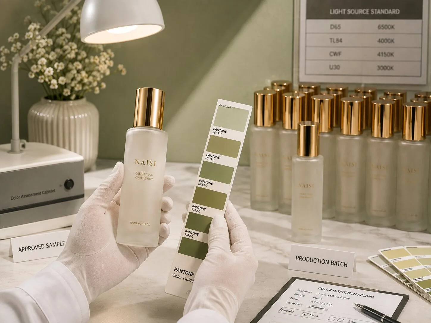
Pantone references provide a useful common language when developing custom cosmetic glass packaging.
A skincare brand may request a warm ivory bottle. A fragrance company may need a specific burgundy tone. Another brand may want a muted green that matches its existing cream jar or secondary packaging.
Providing a Pantone reference gives the supplier a much clearer starting point for color development.
The final bottle, however, is a physical glass object.
Its appearance depends on more than the color reference alone.
Glass transparency, the base appearance of the container, coating opacity, surface character, bottle geometry, and lighting can all influence how the finished color is perceived.
The same target color may therefore look slightly different on clear glass, a matte surface, or a bottle with a more opaque coating.
Bottle shape also affects perception.
A flat front panel reflects light differently from a curved cylindrical surface. Thick glass areas can create additional optical depth. Shoulders, corners, and heavy bases may make the same color appear visually different from the main bottle body.
For this reason, Pantone color matching for glass bottles should progress from a color reference to an approved physical sample.
The Pantone reference establishes the target.
The decorated bottle shows how that target actually appears on the selected glass container.
This distinction is especially important for spray coated cosmetic glass bottles because the brand is evaluating the complete visual result rather than an isolated color.
Closures also influence perception.
A champagne gold cap can make a neutral bottle appear warmer. A black pump creates stronger contrast. White silk screen printing may make the surrounding color feel deeper.
The complete assembled package therefore provides a more useful approval reference than the bottle alone.
Before mass production, brands should confirm the visual characteristics that matter most.
For one project, exact color direction may be the priority. Another may place greater emphasis on the matte appearance. A translucent bottle may require careful control of opacity. Gradient packaging may need an agreed transition position and visual balance.
Once the final sample is approved, keeping a physical master sample provides both the buyer and supplier with a practical reference for production comparison.
A Pantone number starts the color conversation.
The approved physical bottle establishes the commercial appearance.
Glass Batch Variation
Cosmetic glass bottle appearance begins with the glass itself, before any secondary decoration is applied.
Glass composition, forming conditions, bottle geometry, glass distribution, and the selected material specification all contribute to the visual character of the finished container.
For buyers sourcing premium cosmetic glass bottles, clarity is often one of the first characteristics they evaluate.
High clarity glass is particularly attractive for serums, foundations, skincare treatments, and fragrances because the container itself becomes part of the visual presentation.
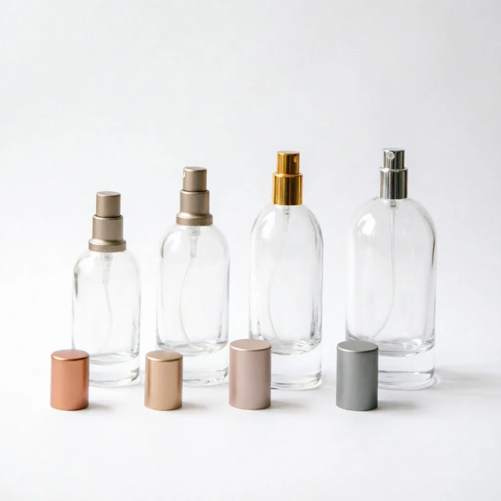
When the design uses clear glass and minimal decoration, subtle characteristics in the glass become easier to see.
Base tone is one example.
Small differences in the optical appearance of clear glass can become more noticeable when bottles are placed against a white background or photographed under controlled studio lighting.
Bottle geometry also changes how glass appears.
A substantial glass base contains more glass in the viewing path than a thinner wall. Corners, shoulders, curved sections, and transitions can refract and reflect light differently.
This is why two areas of the same bottle may appear visually different even though they belong to one container.
Glass distribution is another important manufacturing consideration.
For cosmetic glass bottles, buyers should focus on consistent glass distribution rather than assuming that greater wall thickness automatically represents higher quality.
The body, shoulder, heel, base, corners, and other structural transitions should be evaluated as part of the complete bottle design.
Dimensional consistency should also be reviewed separately from visual appearance.
Bottle dimensions become particularly important when the container must work with a pump, dropper, cap, collar, or other closure component.
For procurement teams, this means glass specifications should be established during sourcing.
Confirm the selected glass material and expected appearance with the manufacturer. Review representative physical bottles. Where relevant, confirm dimensional requirements through technical drawings and agreed inspection criteria.
Production samples should then be compared with the approved reference under consistent conditions.
Place both bottles against the same background.
Use the same lighting.
Compare equivalent areas of the glass.
This gives buyers a much more reliable evaluation than comparing a physical production bottle with a photograph of the original sample.
The objective is controlled batch consistency according to an agreed standard.
For minimalist beauty packaging, this becomes particularly important. When a bottle uses very little decoration, glass clarity, proportions, base appearance, and surface quality carry more of the visual identity.
Material control is therefore the foundation of the finished packaging.
Managing Spray Coating Consistency in Mass Production
Spray coating gives beauty brands considerable flexibility when customizing existing glass bottles.
A standard clear bottle can become warm ivory, deep green, matte black, soft pink, burgundy, or another brand specific color. Depending on the selected coating system and approved design, brands can also develop different levels of opacity, transparency, gloss, matte appearance, and gradient effects.
This makes spray coating especially useful for private Portuguese and DTC beauty brands that want recognizable packaging while working with established glass bottle shapes.
Once the project moves into mass production, the appearance needs to be translated into clear production references.
Color is only one part of the evaluation.
Buyers should also consider coverage uniformity, surface appearance, gloss level where relevant, and the visual consistency of gradient transitions.
A representative preproduction sample provides a practical benchmark.
Consider a fragrance bottle that moves from a deep color at the base toward greater transparency near the shoulder.
The brand designer may describe this simply as a gradient bottle.
For production, the visual standard requires more detail.
Where should the transition begin?
How strong should the color appear at the base?
How much transparency should remain toward the top?
Which side of the bottle will become the primary presentation surface?
How should the gradient look once the logo, pump, collar, and cap are assembled?
These questions help transform a creative concept into a production reference.
Critical appearance areas can also be established with the supplier.
The front of a serum or fragrance bottle often receives particular attention because it carries the main branding and becomes the primary view in ecommerce photography. A sculptural bottle may have other surfaces that are equally important to the design.
Multi process decoration requires further coordination.
For example, a spray coated glass bottle may later receive silk screen printing or hot stamping. The printed or metallic detail needs to work visually with the coated surface.
This makes the final decorated sample particularly valuable.
A brand should ideally evaluate the bottle as consumers will experience it: glass container, color, logo, closure, and visible components working together.
The approved sample then becomes the visual benchmark for mass production.
For repeat orders, retaining the physical reference also helps maintain continuity across future production batches.
Strong spray coating consistency comes from clear specifications, representative sampling, controlled production, and agreed inspection criteria.
The more precisely the desired appearance is defined during sampling, the easier it becomes for the production and quality teams to evaluate the finished bottles.
Lighting Difference Between Sample Room & Fábrica Production
Sometimes a bottle appears different even when the physical finish remains very close to the approved sample.
The viewing environment has changed.
Light has a major influence on how cosmetic glass packaging is perceived.
Natural daylight, warm indoor lighting, cool factory lighting, photography lights, and retail illumination can all change the visual impression of the same color.
Surface appearance also affects the result.
Glossy bottles create stronger highlights and reflections. Matte surfaces diffuse light more softly. Metallic details shift according to the viewing angle. Transparent and translucent colors interact with both the light source and the background behind the bottle.
This is why packaging sample approval benefits from consistent viewing conditions.
When comparing an approved sample with a production sample, place both bottles under the same light source and against the same background.
View them from similar angles.
Then examine both bottles under other lighting environments relevant to the final market.
For a DTC skincare brand, ecommerce photography may be particularly important.
For a fragrance brand entering physical retail, store lighting becomes another useful viewing environment.
A packaging design should maintain its intended character across the situations where consumers are likely to encounter it.
Photography deserves separate consideration.
Camera exposure, white balance, editing, background color, and display settings can all influence how a bottle looks in a digital image.
A photograph is therefore valuable for communication and documentation, while the approved physical sample remains the stronger reference for direct production comparison.
This distinction becomes particularly important when teams work internationally.
A buyer may receive sample photographs from a supplier before the physical bottle arrives. Those photographs can help confirm the general direction, but final visual approval is more reliable when the brand can evaluate an actual decorated bottle.
The same principle applies to repeat orders.
Keeping an approved physical master sample gives the procurement team and supplier a tangible reference when a product returns to production months later.
It also supports future collection development.
If the original serum bottle establishes a specific matte beige appearance, that reference can help when the brand later develops a matching lotion bottle or cream jar.
Consistent viewing conditions and physical references turn subjective color discussions into a more structured quality process.
Final Thoughts
The transition from a packaging sample to mass production is a critical stage in cosmetic glass packaging development.
The approved sample establishes the visual target. Commercial production then translates that target into glass specifications, decoration standards, inspection criteria, and repeatable production references.
For color development, a Pantone reference provides a useful starting point, while the approved physical bottle establishes how that color actually appears on glass.
For the glass container itself, buyers should consider clarity, base appearance, dimensions, bottle geometry, and glass distribution according to the agreed material and quality specifications.
For spray coated bottles, color should be evaluated together with coverage, surface appearance, opacity, gloss level, and gradient characteristics where applicable.
Viewing conditions complete the picture.
Comparing an approved sample and production bottle under the same lighting and background creates a much more meaningful evaluation. Physical master samples also provide a valuable reference for repeat orders and future product extensions.
For procurement teams, the most practical approach is to establish clear approval references before mass production.
Keep the approved physical sample. Record the relevant color reference. Confirm the glass and dimensional specifications. Define important appearance areas. Approve representative decoration samples and retain them for production comparison.
This creates a clearer working standard between the brand, packaging supplier, decoration team, and quality team.
It also supports long term brand consistency.
A well documented cosmetic glass packaging standard can continue from a serum bottle into lotion bottles, cream jars, foundation bottles, or future fragrance collections. Color, surface appearance, typography, and closure details become part of a repeatable packaging language.
For beauty brands, consistency begins long before the finished bottles reach the filling line.
It begins with a packaging sample that is defined clearly enough to become a reliable production reference.
NAISI Packaging supplies stock and custom cosmetic glass bottles for skincare, fragrance, and beauty brands, with sampling and decoration options including frosting, sandblasting, silk screen printing, hot stamping, and spray coating.
Preparing a packaging sample for mass production? NAISI Packaging can support glass bottle sampling, decoration development, and production reference confirmation.
🏭 Watch Our Fábrica Production Videos