日本語
日本語 English
 Deutsch
 한국어
한국어 العربية
 Русский
 Türkçe
 Português
 Français
Matte, Glossy or Gradient? Choosing the Right Finish for Different Beauty Categories
Place the same glass bottle in three different finishes and it can tell three completely different brand stories.
A soft matte bottle may feel calm, refined, and skincare focused. Clear glossy glass can appear fresh and precise while allowing the formula or bottle geometry to become part of the design. A gradient color treatment creates stronger visual movement and can give fragrance packaging a more expressive personality.
For beauty brands, choosing a cosmetic bottle finish is therefore much more than selecting an attractive surface.
The finish influences how consumers interpret the product before they read the label. It also affects how a packaging collection appears in ecommerce photography, retail displays, gift sets, and social content.
The best choice depends on what the product needs to communicate.
Skincare often benefits from visual restraint and consistency across several SKUs. Fragrance has greater freedom to use the bottle as an emotional and artistic object. Body care usually works with larger containers, where color and surface appearance need to remain visually balanced.
This guide focuses specifically on those visual decisions rather than the technical details of how each decoration is produced.
Skincare Product Suitable Finish
Skincare packaging usually has to communicate several things quickly.
Consumers want to understand whether a product feels clinical, botanical, luxurious, gentle, active focused, or designed for everyday use. The bottle surface can help establish that impression before typography explains the formula.
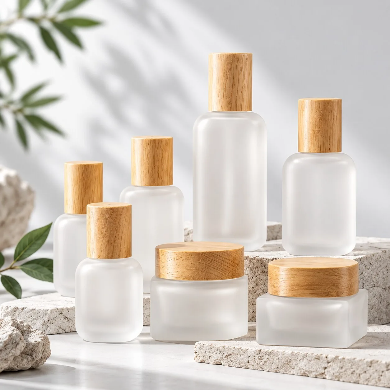
Matte and frosted appearances work particularly well for minimalist skincare.
The softer surface diffuses reflections and gives the glass a restrained character. Combined with a simple cylindrical or square bottle, it can support the quiet luxury aesthetic used across many contemporary skincare collections.
This direction also works naturally with neutral palettes.
Warm ivory, soft beige, muted green, pale grey, and understated earth tones can create a calm visual environment for hydration, barrier care, anti aging, and premium treatment ranges.
The closure then becomes part of the composition.
A matte bottle with a polished metallic cap creates contrast. The same bottle with a soft matte closure feels more uniform and understated. Black or white pumps can push the design toward a cleaner, more functional skincare identity.
For brands that want transparency, clear glossy glass offers another strong direction.
High clarity glass allows the natural color of the formula to contribute to the visual presentation where the formula and product development requirements support transparent packaging. It also makes the geometry of the glass more visible.
Thick bases, rounded shoulders, sharp corners, and internal reflections become design features.
This can work particularly well for hydrating serums, facial oils, essences, and products where visual purity is part of the brand message.
The key is coordination.
A skincare range rarely consists of one container. A typical collection may eventually include a 30ml serum bottle, a 50ml lotion bottle, a cream jar, and other treatment products.
The selected finish should therefore work across different shapes and capacities.
A matte serum bottle and a highly reflective cream jar can feel disconnected unless that contrast is intentional. Keeping the glass appearance, typography, closure colors, and decorative language related creates a much stronger product family.
For premium skincare brands, visual discipline often creates more value than visual complexity.
One carefully selected finish, combined with clean typography and well matched components, can give an entire collection a confident identity.
Perfume Product Suitable Finish
Fragrance packaging plays a different role.
A skincare bottle usually supports the product story. A perfume bottle can become a major part of the story itself.
Consumers often experience fragrance through emotion, color, memory, atmosphere, and personal identity. Packaging has room to communicate these ideas before the fragrance is ever sprayed.
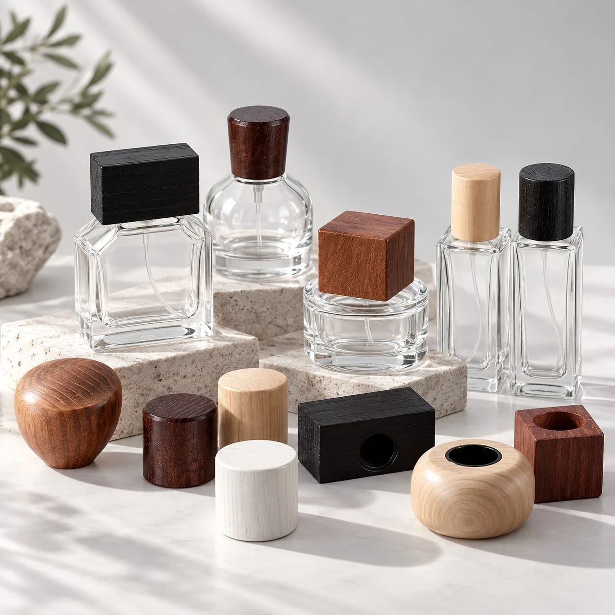
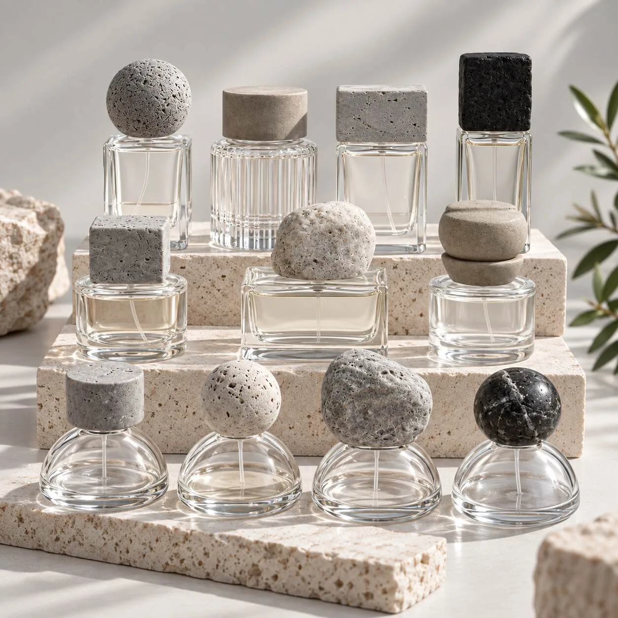
Clear glossy glass remains one of the strongest choices for perfume packaging.
It allows the fragrance color to remain visible while emphasizing bottle geometry. On a well proportioned perfume bottle, the transparency itself can feel luxurious because light interacts with the walls, base, shoulders, and liquid inside.
This approach suits brands built around simplicity.
A clear bottle with a carefully selected cap, clean typography, and restrained decoration can create a strong niche fragrance identity without relying on an elaborate surface treatment.
Gradient color takes fragrance in another direction.
A well considered gradient can create visual movement and help communicate the mood of a fragrance collection. Dark to clear transitions can feel atmospheric. Warm tonal changes may support richer scent concepts, while fresh color combinations can create a lighter, more contemporary impression.
For niche fragrance brands, this gives the bottle greater storytelling power.
Different fragrances within the same family can also use related gradient directions while keeping the bottle shape and typography consistent. The collection remains recognizable while each scent develops its own personality.
Deep translucent colors offer another option.
Amber, smoky tones, deep green, burgundy inspired shades, and other controlled color directions can give fragrance packaging a richer visual character. The result depends on the bottle geometry, transparency, fragrance color, and surrounding components.
Cap selection becomes especially important here.
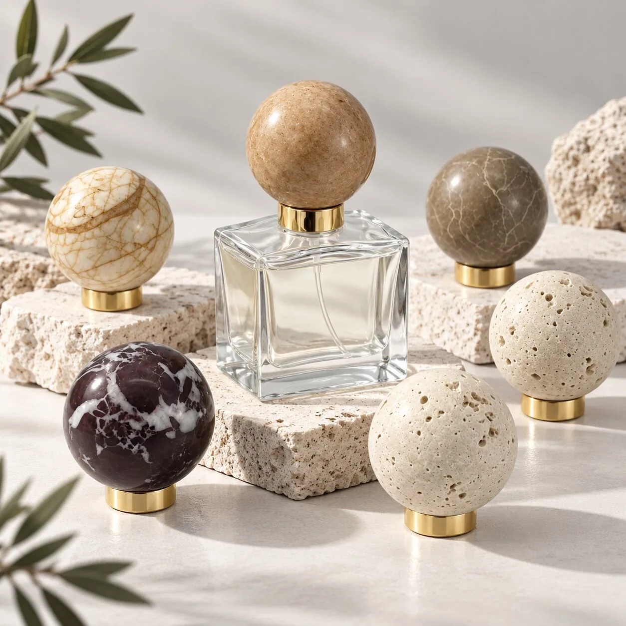
A substantial metallic cap can provide contrast against clear glass. Matte metal can soften a deep colored bottle. A coordinated cap and collar can connect the closure with a small metallic logo or other restrained decorative detail.
The most successful cosmetic bottle finish for perfume should support the fragrance concept rather than compete with it.
For packaging buyers, viewing the complete assembled bottle is particularly useful. Glass color can look different once the fragrance, pump, collar, and cap are present.
A physical sample reveals the final visual balance far better than evaluating a finish in isolation.
Body Care Product Suitable Finish
Body care packaging operates in a different visual environment from a 30ml serum or 50ml perfume bottle.
The containers are often larger. They may sit in bathrooms, on vanities, beside sinks, or within broader personal care routines. The packaging therefore needs enough visual presence to remain recognizable while still feeling comfortable in everyday surroundings.
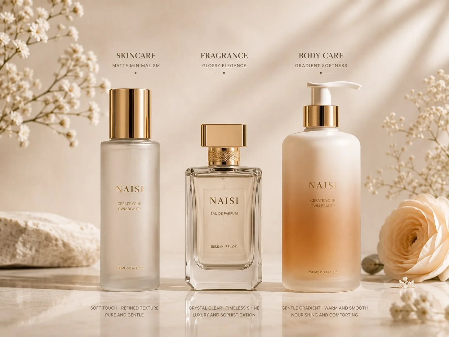
Soft matte finishes work well in this category.
They can give larger glass lotion or body care bottles a tactile, approachable appearance. Neutral and natural color directions also fit easily into wellness focused, spa inspired, botanical, and premium personal care collections.
Because the container occupies more visual space, restraint becomes valuable.
A large bottle covered with several competing graphic and decorative elements can become visually heavy. A clean surface with controlled typography allows the proportions of the container to feel more balanced.
Glossy glass can communicate a different personality.
Clear or colored glossy surfaces can suit body care brands built around freshness, energy, fragrance, or more expressive color identities. Reflections can make the packaging appear lively in lifestyle photography and bright retail environments.
The formula may also contribute visually when transparent packaging is appropriate for the product.
For example, the relationship between bottle color, formula color, and pump finish can become part of the design.
Brands selling body wash, body lotion, body oil, and hand care within one range should think beyond each individual SKU.
A shared color family can connect different containers. The surface appearance can remain consistent while the bottle sizes change. Pump colors, caps, and typography can repeat across the collection.
Lifestyle context deserves attention too.
Skincare packaging is frequently photographed close to the face or on a vanity. Perfume often appears as a decorative object. Body care is commonly shown in bathrooms, spa settings, bedrooms, and everyday wellness environments.
The selected finish should feel natural in those settings.
This is especially relevant for DTC brands because lifestyle photography often becomes one of the first places customers experience the packaging.
A cosmetic glass bottle finish that looks attractive as an isolated sample should also work when surrounded by towels, stone surfaces, mirrors, water, natural materials, and other products.
Thinking about the final environment makes finish selection more commercially useful.
Visual Matching for Different Beauty Categories
The most effective packaging decisions begin with brand positioning.
Before choosing matte, glossy, or gradient, define what the customer should feel when they first see the product.
A clinical skincare brand may want precision and visual clarity.
A quiet luxury skincare line may favor soft surfaces, neutral tones, and restrained typography.
A niche perfume brand may use gradient color to communicate emotion.
A premium body care collection may rely on matte glass and natural tones to fit into a lifestyle driven environment.
Once that direction is clear, finish selection becomes easier.
Photography should be considered early as well.
Ecommerce has changed the role of packaging. Many customers first encounter a product as a small image on a mobile screen rather than as a physical bottle on a retail shelf.
Different finishes behave differently under photography.
Glossy glass creates highlights and reflections that can emphasize shape. Matte surfaces soften those reflections and can make typography visually prominent. Gradient bottles can create strong visual distinction when the color transition remains clear at smaller image sizes.
Brands selling through both ecommerce and physical retail should consider both environments.
Retail shelves introduce surrounding colors, artificial lighting, and competing packaging. Ecommerce gives the brand greater control over background, lighting, and composition.
A strong package needs a visual identity that remains recognizable across both.
Collection planning matters just as much.
A skincare brand expanding into body care may want the new products to feel related without making every bottle identical. Keeping a consistent neutral color family while changing the surface appearance slightly can create category distinction within the same brand.
A skincare and makeup brand might repeat the same frosted appearance and metallic closure tone across serum and foundation packaging.
Fragrance collections can use a shared bottle silhouette while assigning different gradient colors to individual scents.
These systems help consumers recognize the brand while still understanding differences between products.
Closure materials also influence how the finish is perceived.
Matte glass paired with matte components creates a quiet, continuous surface language. Pairing the same glass with polished metal introduces a sharper luxury contrast.
Clear glossy bottles can work with metallic, black, white, or colored closures depending on the intended positioning.
Typography provides the final connection.
A bottle can have a beautiful surface treatment and still feel disconnected from the wider brand if logo scale, print placement, or text color changes randomly across products.
Consistent typography creates order.
This becomes especially important when several container types are involved. Serum bottles, cream jars, lotion bottles, perfume bottles, and foundation containers naturally have different dimensions. Shared graphic rules help bring those forms into one recognizable packaging system.
For buyers, there is also a practical advantage to defining the visual system before sourcing every SKU.
Instead of asking a supplier for isolated bottle recommendations, provide the broader collection direction.
Share the intended product categories, preferred glass appearance, color family, closure direction, and overall positioning.
The supplier can then identify existing bottle families and compatible container formats that support the concept.
Stock glass bottles can be particularly useful for emerging brands.
A mature bottle shape can serve as the foundation, while carefully selected surface appearance, color, printing, and closure components create a more distinctive brand identity. This allows the visual system to develop without making every SKU dependent on a unique custom bottle mold.
As the brand grows, proprietary bottle shapes can be introduced while maintaining the established finish, color, and typography language.
The packaging evolves with the brand rather than starting from a completely different visual direction for every launch.
Ultimately, the right cosmetic bottle finish is the one that communicates the product category and brand positioning clearly.
Matte, glossy, and gradient appearances each have their place.
The decision becomes stronger when surface appearance, glass shape, closure, typography, product category, and photography are considered as one visual system.
Final Thoughts
Matte, glossy, and gradient packaging can all create a premium beauty presentation. Their value comes from how well each direction fits the product.
For skincare, matte and frosted appearances can support minimalist, clinical, and quiet luxury positioning, while clear glossy glass can emphasize transparency and visual purity.
Perfume offers more freedom for storytelling. Clear glass highlights bottle architecture and fragrance color, while gradient and deeper translucent colors can give niche fragrance collections a stronger emotional identity.
Body care benefits from finishes that remain balanced across larger containers and fit naturally into bathroom, vanity, spa, and lifestyle settings.
Across every category, consistency brings the collection together.
Glass appearance, color family, closure finish, typography, and bottle proportions should feel related even when individual products serve different functions. This gives beauty brands a recognizable packaging language that can continue as the range expands.
For procurement teams, that is the most useful way to evaluate finish options.
Start with the brand positioning and product category. Consider how the bottle will appear in the customer's hand, in ecommerce photography, on a retail shelf, and beside other products in the collection. Then select the finish that supports those environments.
NAISI Packaging supplies stock and custom cosmetic glass bottles for skincare, fragrance, body care, and beauty brands, with customization options including frosting, sandblasting, silk screen printing, hot stamping, and spray coating.
Comparing matte, glossy, or gradient packaging for your next collection? Explore cosmetic glass bottle options with NAISI Packaging.