한국어
한국어 English
 日本語
日本語 Deutsch
 العربية
 Русский
 Türkçe
 Português
 Français
How Beauty Brands Build a Unified Cosmetic Packaging Collection
A new beauty brand often begins packaging development with a simple request: “We need a 30ml serum bottle.”
That works for one product. As the brand grows, the packaging challenge changes.
The next launch may require a 50ml lotion bottle. Then comes a 50g cream jar, a facial oil with a dropper, or a foundation bottle with a pump. When every container is selected independently, the product line can gradually lose visual consistency.
Experienced beauty brands approach packaging differently.
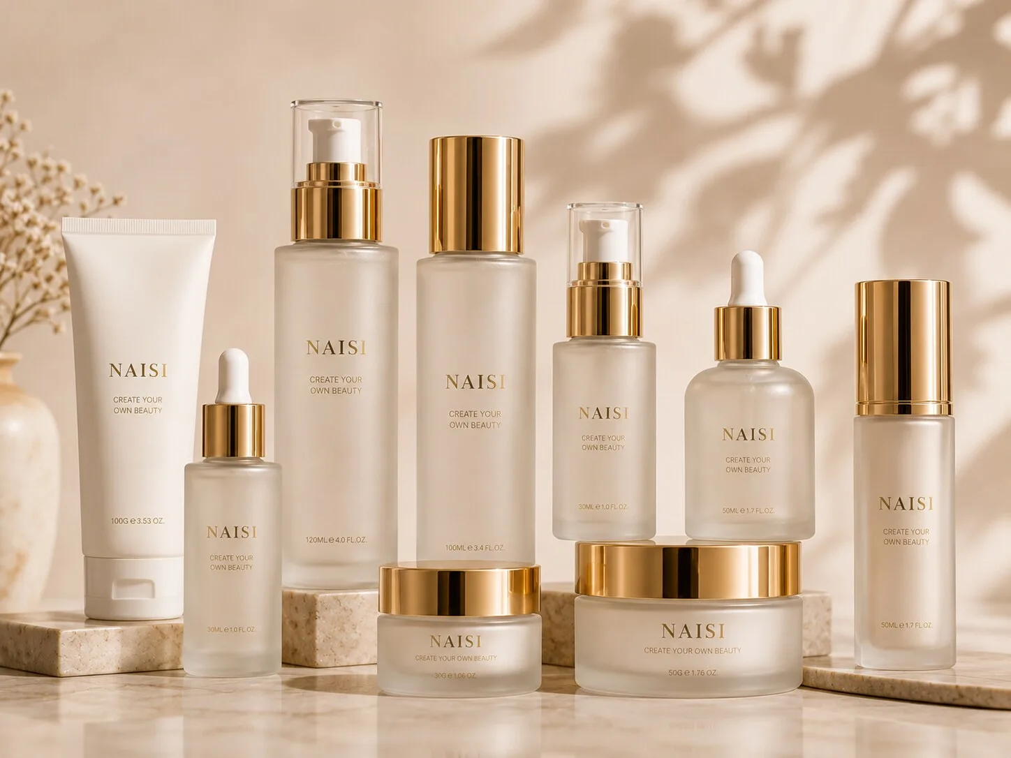
They build a cosmetic packaging collection around a shared visual language. Bottle shapes, glass appearance, closure colors, decoration, proportions, and logo placement are considered together. Each container still performs its own function, yet customers can immediately recognize that the products belong to the same brand.
This approach has practical sourcing advantages as well.
A coordinated packaging system can simplify component selection, decoration planning, sampling, photography, and future line extensions. It also gives procurement teams a clearer framework when discussing new products with packaging suppliers.
For skincare, fragrance, makeup, and private label brands planning more than one SKU, thinking at collection level can create stronger branding and more efficient product development.
Benefits of Building One Unified Collection
A strong packaging collection starts with consistency rather than identical containers.
A serum bottle and a cream jar naturally have different structures. One may use a pump or dropper, while the other requires a wide opening and cap. The objective is to find visual details that connect them.
Shape is often the first connection.
A brand using clean cylindrical serum bottles can continue that geometry through lotion bottles and cream jars. Another brand may build its identity around square shoulders, rounded corners, thick glass bases, or soft oval forms.
The products remain functionally different while sharing recognizable design cues.
Color provides another connection.
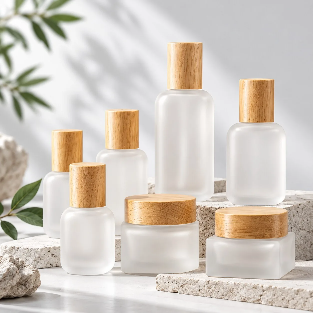
Clear high clarity glass across several SKUs creates a clean, unified presentation. Frosted glass can establish a softer visual language. Custom spray colors can identify different formulas while remaining within one controlled brand palette.
Decoration then reinforces the system.
Consistent silk screen logo placement, a shared hot stamped accent, or a repeated matte finish can make different containers feel related. The design becomes easier for consumers to recognize on a retail shelf or ecommerce product page.
Closures deserve the same attention.
A champagne colored pump on a serum bottle can coordinate with the cap of a cream jar. Matte black components can connect a lotion bottle with a foundation package. Similar metallic tones across pumps, collars, caps, and droppers create a more considered presentation.
This visual consistency is valuable in ecommerce.
Customers often see several products together in website banners, social media posts, product bundles, and routine sets. A coordinated skincare packaging collection photographs more naturally because the products already share a common design language.
Gift sets benefit too.
When the serum, lotion, and cream appear together inside one box, consistent proportions and decoration make the assortment feel intentionally developed as a collection.
There is also a sourcing advantage.
Once the brand establishes its glass appearance, closure direction, logo treatment, and decoration standards, each future launch has a clearer starting point. Product development becomes an extension of an existing system rather than a completely new design exercise.
For procurement teams, that means more structured conversations with suppliers.
Instead of sourcing one container at a time, buyers can ask which bottle families offer several capacities, which jars visually coordinate with those bottles, and which components can share the same finish.
That creates a foundation for long term packaging development.
Bottle
For many skincare brands, the bottle becomes the anchor of the entire packaging collection.
Serums, essences, lotions, and liquid treatments often represent several important SKUs within one range. Their bottles therefore establish much of the brand's visual language.
Start with silhouette.
If the hero serum uses a straight cylindrical bottle with rounded shoulders, the lotion bottle can follow similar proportions at a larger capacity. If the serum has a square profile with softened corners, look for larger formats that continue the same geometry.
Exact duplication is rarely necessary.
What matters is visual relationship.
A 30ml serum and 50ml lotion have different functional requirements. Their heights, diameters, neck finishes, and dispensing systems may vary. Keeping selected proportions and design details consistent allows them to feel like members of the same family.
Glass appearance is another useful tool.
A collection using clear glass can maintain that clarity across several bottle formats. A brand built around a soft frosted aesthetic can continue the same visual direction through serum and lotion packaging.
Decoration should follow a repeatable rule.
For example, the brand logo may always sit in the upper third of the bottle. Product names may use the same print color. A small metallic detail can appear in the same visual position across capacities.
These details create recognition without requiring every container to use exactly the same dimensions.
Closures complete the relationship.
The serum may use a treatment pump while the lotion uses a different dispensing pump suited to its formula. Their visible components can still share the same color or surface character.
This distinction is important for packaging buyers.
Functional compatibility comes first. Formula viscosity, dispensing requirements, neck finish, and component performance should determine the appropriate system. Visual consistency can then be created through component color, proportion, and decoration.
For a growing brand, stock cosmetic glass bottles can make this process more flexible.
Instead of developing a custom mold for every SKU, buyers can identify an existing bottle family with suitable capacities and then create differentiation through glass finish, color, printing, and coordinated closures.
Custom bottle development becomes more relevant when a proprietary silhouette is central to long term brand identity.
Either way, the collection should be planned before individual bottles are finalized.
Jar
Cream jars introduce a different geometry into the collection.
Their wider proportions create a strong visual presence, especially when displayed beside taller serum and lotion bottles. The challenge is to connect that horizontal form with the rest of the product family.
Geometry provides the first opportunity.
A skincare line based on cylindrical bottles can pair naturally with a round cream jar. Square bottles can coordinate with square or softly squared jars. Similar corner radiuses, glass base proportions, and clean surfaces help maintain the visual relationship.
Jar height also affects the collection.
A low, wide jar can feel substantial and architectural. A taller profile may appear lighter and more compact. The right choice depends on the brand identity and how the jar looks beside other products.
Cap design is especially important.
The cap occupies a large percentage of the visible jar, so its color and material can strongly influence the collection.
If the serum and lotion use matte champagne components, carrying a related champagne tone onto the cream jar cap can immediately connect the products. The exact component construction can vary while the visible language remains consistent.
Surface decoration adds another layer.
A frosted jar paired with frosted bottles creates an obvious family resemblance. Silk screen printing can follow the same typography and logo placement rules. A restrained hot stamped detail can repeat a metallic accent already used elsewhere in the range.
Buyers should also consider how the jar functions.
The container needs to suit the intended cream or balm, filling process, closure system, and any other components selected for the package.
This is why a good cosmetic packaging collection combines visual consistency with category appropriate structures.
The jar should look like part of the serum family while still functioning properly as a jar.
Dropper
A dropper introduces several visible components into a relatively small package.
The bottle, collar, bulb, and pipette all contribute to the finished appearance. This makes dropper selection particularly important for facial oils, serums, concentrates, and other formulas using this dispensing format.
Start with the bottle.
Its shape should connect naturally with the broader skincare line. A 30ml dropper bottle can often become a companion to pump bottles when both share similar shoulders, base proportions, glass finish, or decoration.
Then consider the collar.
Metallic and matte collar finishes can provide an easy visual connection with pumps and cream jar caps elsewhere in the range. A champagne colored collar, for example, may coordinate with other visible closure components even though their internal structures differ.
Bulb color also influences the package.
Black, white, neutral, or custom visual directions create different brand impressions. The choice should support the wider collection rather than being treated as an isolated component decision.
The pipette serves a functional purpose and should be selected with the complete dropper system in mind.
Formula characteristics, intended dosage, bottle dimensions, and component specifications all matter. The actual formula should be evaluated with the selected packaging during product development.
This balance between function and appearance is central to good packaging design.
A dropper can become a recognizable part of the brand language while still being selected around practical dispensing requirements.
For procurement teams, component coordination early in development helps avoid a common problem: finding the right glass bottle first and then struggling to locate a dropper that matches both technically and visually.
Selecting the bottle and dispensing system together creates a smoother path.
Foundation Container
Foundation packaging gives beauty brands an opportunity to extend a skincare inspired packaging language into makeup.
This is increasingly relevant for brands that sell both skincare and complexion products under one visual identity.
Glass foundation bottles can share many design cues with serum packaging.
A consistent silhouette is one option. Similar glass clarity, frosting, or color is another. Coordinated pump finishes and logo placement can make the connection immediately visible.
The formula still drives the functional decision.
Foundation products vary in viscosity and formulation, so the selected dispensing system should suit the actual product. Bottle and pump compatibility should be evaluated as part of the complete package.
Once those requirements are established, the visual system can bring foundation into the broader collection.
Imagine a brand using frosted cylindrical serum bottles with matte ivory components and restrained gold printing.
Its foundation container could continue the frosted glass appearance, retain the ivory and gold palette, and use a pump proportioned for the larger bottle. The package serves a different category while remaining recognizable as part of the same brand.
This approach is particularly useful when a skincare company expands into makeup.
The new product gains some of the visual recognition already established by the original range.
Logo placement plays an important role here.
Keeping typography, print scale, and visual hierarchy consistent can connect packaging formats that have very different shapes. The same applies to cap and pump colors.
For ecommerce brands, the benefit becomes clear when products appear together.
A serum, moisturizer, and foundation can form a visually coherent routine rather than three unrelated packages. Product photography becomes cleaner, bundle presentation becomes stronger, and future launches have an established design framework to follow.
From a procurement perspective, planning ahead can also reveal opportunities to coordinate suppliers and components.
Certain products may share visual component finishes. Others may use related bottle families. Decoration colors can be standardized across suitable SKUs, subject to the requirements of each substrate and process.
The goal is intelligent repetition.
Each new product adds something to the range while continuing a packaging language consumers already recognize.
That is the difference between purchasing containers and building a packaging system.
Final Thoughts
A strong beauty brand rarely grows one isolated bottle at a time.
As the product range expands, packaging needs to work across serum bottles, lotion bottles, cream jars, droppers, foundation containers, and future launches. Each format has its own functional requirements, yet the complete range should still feel connected.
The most effective cosmetic packaging collection begins with a few clear design rules.
Choose a primary shape language. Establish the glass appearance. Define closure colors and metallic tones. Set consistent decoration principles and logo placement. Then apply those rules thoughtfully to each product format.
Function remains central throughout the process.
Serum pumps should suit the serum. Droppers should work with the intended formula and bottle. Cream jars need appropriate closures. Foundation packaging requires a dispensing system selected for the actual product.
Visual consistency is built around those functional decisions.
For emerging private label brands, stock glass bottle families can provide a practical starting point. Several compatible shapes and capacities can be brought together through coordinated frosting, spray color, silk screen printing, hot stamping, and closure selection.
As the brand grows, custom glass bottle development can introduce more proprietary shapes while preserving the visual language customers already know.
The result is more than attractive packaging.
A unified system strengthens recognition across multiple SKUs, creates cleaner ecommerce and retail presentation, and gives procurement teams a clearer framework for future development. New launches become extensions of an established collection rather than separate packaging projects starting from zero.
That makes packaging easier to scale with the brand.
NAISI Packaging supplies stock and custom cosmetic glass bottles for skincare, fragrance, and beauty brands, with options for coordinated bottles, jars, components, and surface decoration including frosting, sandblasting, silk screen printing, hot stamping, and spray coating.
Planning a complete beauty packaging collection? NAISI Packaging can help coordinate glass bottles, jars, components, and decoration across your product line.