English
 日本語
日本語 Deutsch
 한국어
한국어 العربية
 Русский
 Türkçe
 Português
 Français
The Hidden Cost of Choosing Too Many Cosmetic Decoration Processes
A standard glass bottle can look completely different after decoration.
A matte surface creates a quiet, refined character. Custom color can make a stock bottle instantly recognizable. A precise printed logo adds brand identity, while a small metallic detail can bring focus to an otherwise minimal design.
This flexibility is one of the reasons glass remains so attractive for skincare, fragrance, and private label beauty packaging.
Yet there is another side that packaging buyers should understand.
Every additional cosmetic decoration process becomes another production stage. The bottle needs to move through additional handling, processing, inspection, and approval. When several finishes are combined, the relationship between those processes becomes just as important as the quality of each individual finish.
For procurement teams, the real question is therefore less about how many effects can fit on one bottle and more about which finishes genuinely contribute to the intended brand image.
A successful packaging design uses decoration with purpose.
Understanding how sandblasting, spray painting, silk screen printing, and hot stamping work together can help brands achieve a premium appearance while keeping production planning practical.
Why Combined Multiple Decoration Drives Up Cost
A design rendering can make a multi finish bottle look surprisingly simple.
The production process tells a different story.
Imagine a skincare brand wants a glass serum bottle with a matte surface, custom color, printed product information, and a metallic logo. Each visual element may require its own production operation depending on the final specification.
The bottle moves from one stage to the next. At each stage, handling, process setup, inspection, and production coordination become part of the total project.
That additional work contributes to cost.
Sampling is one of the first areas where buyers see the difference.
A bottle using one decoration technique can often be evaluated around a relatively focused set of appearance requirements. Once several finishes are combined, the approval becomes more detailed.
The brand may need to evaluate surface texture, color, transparency, logo positioning, metallic appearance, and the relationship between all of these elements.
A change to one detail can also influence another.
For example, a printed logo can appear different when applied over a colored surface compared with clear glass. A metallic detail may create stronger contrast on a matte background than on a glossy one. Color perception also changes according to the glass substrate, coating opacity, lighting, and surrounding components.
This makes physical samples especially valuable.
Production sequence matters as well.
Different decoration combinations require an appropriate process route. The exact sequence depends on the bottle, materials, decoration systems, design, and factory process. Buyers should therefore confirm feasibility with the supplier rather than assuming that every visual effect can simply be stacked in any order.
Appearance consistency is another consideration.
When multiple processes meet on the same bottle, inspection needs to cover both individual finish quality and the relationship between finishes. Logo positioning, color coordination, coverage, edge definition, and overall appearance may all become part of the approved standard.
This can influence production planning and lead time.
For emerging beauty brands, a useful starting question is:
What should customers notice first when they see this bottle?
If the answer is the soft matte surface, let that feature carry the design.
If custom color creates the strongest brand recognition, build around the color.
If the logo is the hero detail, a restrained metallic accent may provide enough differentiation.
This approach keeps cosmetic decoration focused on visual priorities rather than the number of processes used.
Premium packaging often feels considered because every detail has a reason to be there.
Sandblasting
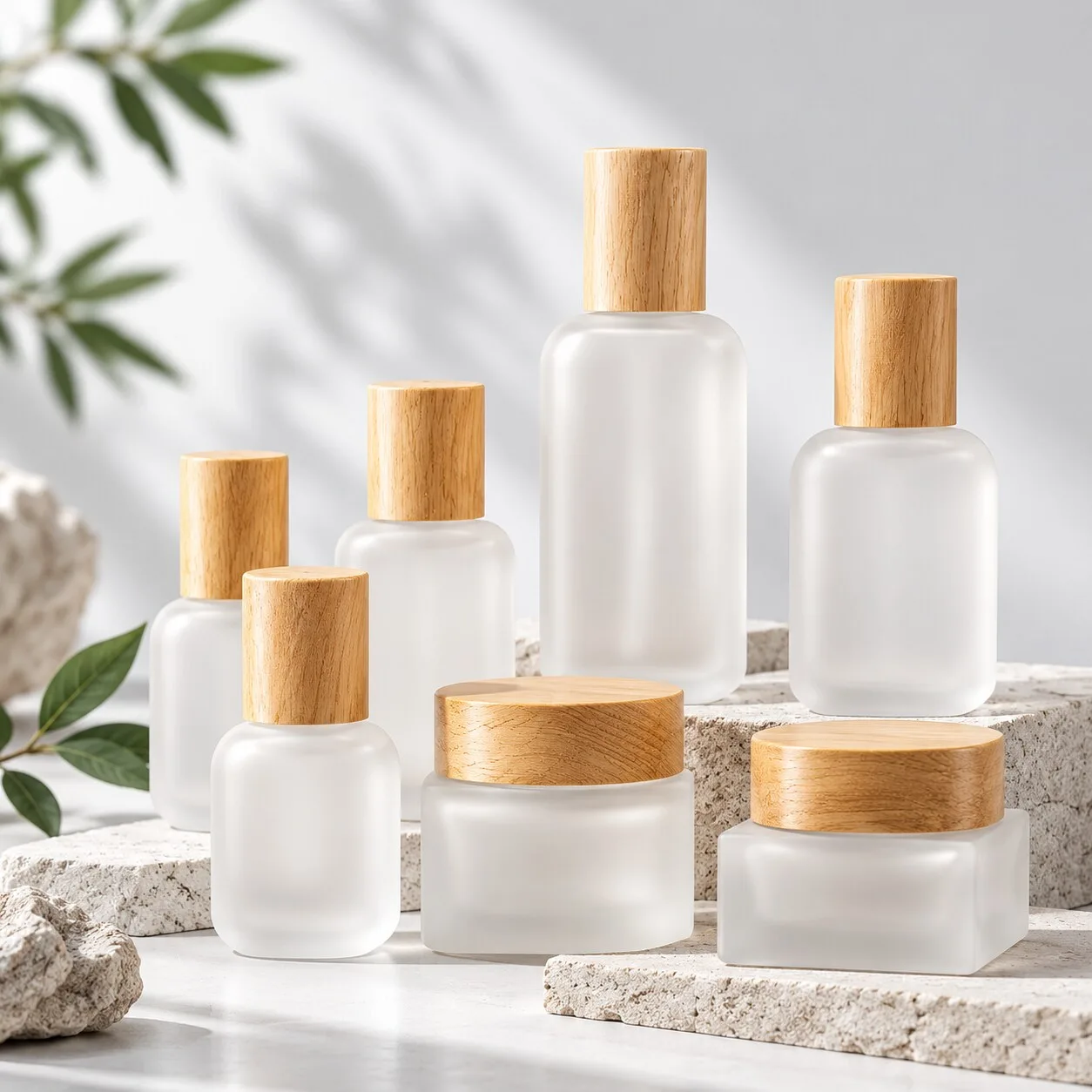
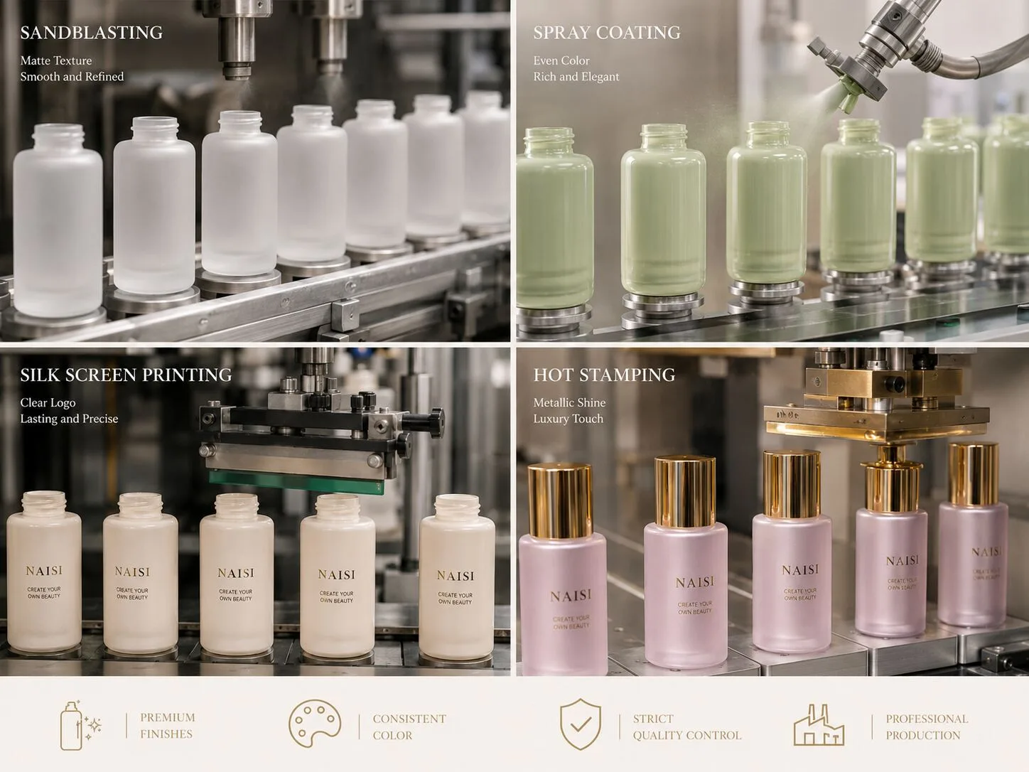
Sandblasting can give glass a soft matte character and create a tactile visual impression that works particularly well for understated beauty packaging.
The treatment changes how light interacts with the glass surface. Instead of the sharp reflections associated with clear glossy glass, the bottle takes on a more diffused appearance.
For skincare brands, this aesthetic can support minimalist serums, facial oils, lotions, and treatment collections. It also pairs naturally with neutral colors, restrained typography, and simple closure designs.
Fragrance brands can use the same visual language when they want the bottle to feel architectural, soft, or quietly luxurious.
From a sourcing perspective, consistency deserves attention.
A buyer should review the overall appearance across the bottle rather than judging a small isolated area. The shoulder, body, base, and curved surfaces should visually support the approved design. Bottle geometry can influence how the finished surface is perceived under different lighting.
The level and character of the matte effect should also be agreed through representative samples.
This matters because words such as "matte" or "frosted look" describe a visual direction rather than a complete production specification. A physical reference gives both the buyer and supplier a clearer benchmark.
Sandblasting can also work effectively as the primary design feature.
A well proportioned high clarity glass bottle with a controlled matte surface, clean logo, and coordinated cap can already create a strong premium presentation.
Adding several other effects may serve certain brand concepts, but it should come from a clear design purpose.
For a small private label skincare brand, allowing the glass shape and matte surface to lead can keep the packaging visually sophisticated while making development easier to manage.
That is a good example of decoration creating value through restraint.
Spray Painting
Spray painting or spray coating gives beauty brands broad freedom to develop a distinctive color identity.
It can transform the visual character of an existing glass bottle without requiring a completely new bottle shape.
For growing brands, this can be especially useful.
A stock serum or lotion bottle may already provide the desired proportions and component compatibility. A carefully selected custom color can then make the packaging feel much more closely connected to the brand.
Depending on the approved decoration system and design, spray coating can create different visual effects in color, transparency, opacity, and surface appearance.
The important sourcing step is defining the intended result clearly.
A color reference is a useful starting point, but the final appearance needs to be evaluated on the actual glass bottle. Glass transparency, coating coverage, bottle geometry, surface character, and lighting can all influence how a color is perceived.
Physical samples provide the most practical reference.
Buyers should also define the areas that matter most for appearance.
Does the brand want a fully colored bottle?
Should some glass remain visible?
Is the intended result opaque or translucent?
What level of surface appearance should match the approved sample?
These questions give the supplier a clearer production target.
The relationship with other decorative elements also matters.
A white silk screen logo on a deep matte color creates one visual language. A small metallic logo on a muted neutral background creates another. Bright colors combined with larger graphic elements may suit a younger DTC brand.
None of these directions is universally more premium.
The right result comes from consistency with the product positioning.
For procurement teams managing several SKUs, color planning can also help build a recognizable packaging collection. Different products can share the same bottle family while using coordinated colors to distinguish formulas or product categories.
That creates differentiation without redesigning the glass structure for every launch.
Silk Screen Printing
Silk screen printing is one of the most familiar ways to add branding and product information to cosmetic glass bottles.
Its strength lies in precision and control.
A clean logo, product name, or simple graphic can give a standard glass container a distinctive identity while preserving the bottle's overall form.
For minimalist beauty packaging, this can be especially effective.
Consider a clear 30ml serum bottle with a carefully positioned black logo. The design may use very few elements, yet the combination of glass clarity, typography, bottle proportions, and closure color can create a complete premium presentation.
The same principle works on matte and colored bottles.
The surrounding surface changes the way printed graphics are perceived, so color selection should be considered together with the bottle finish.
Legibility is important.
Very fine text, complex artwork, and small details need to be evaluated according to the printable area and actual bottle geometry. A cylindrical surface behaves differently from a flat panel. Curved shoulders and shaped bottles can introduce additional design considerations.
Artwork preparation should therefore happen with the real container in mind.
Before production, confirm the final artwork, print color, position, scale, and orientation.
Physical samples make these decisions much easier.
Buyers can evaluate whether the logo sits at the correct visual height, whether the print works with the cap, and whether the complete package remains balanced from the front and side.
For a packaging collection, consistent logo placement can also strengthen brand recognition.
A serum bottle, lotion bottle, and cream jar can use different dimensions while maintaining a shared visual system through typography, print color, and positioning.
This is where cosmetic decoration becomes part of brand architecture rather than a finishing step added at the end.
Hot Stamping
Hot stamping is often selected when a beauty brand wants a controlled metallic accent.
Used carefully, it can draw attention to a logo, border, product name, or selected design detail without dominating the bottle.
This makes it useful for premium skincare, fragrance, and gift oriented packaging.
The visual impact depends heavily on proportion.
A small metallic logo on a matte bottle can create a focused luxury detail. A narrow metallic line may connect visually with an aluminum colored cap or pump collar. Larger metallic areas create a stronger decorative statement and need to be balanced with the bottle shape, typography, and surrounding finish.
Color coordination is particularly important.
Gold is not a single visual identity. Different metallic tones can feel warmer, cooler, brighter, or more subdued. The chosen effect should work with the glass color, coating, cap, pump, and overall brand palette.
The same applies to silver and other metallic directions.
For buyers, the complete assembled package provides the best reference.
Looking at a hot stamped logo alone gives only part of the picture. Once the cap, pump, bottle color, and product label are brought together, the visual balance becomes much easier to judge.
Sample approval becomes especially valuable when hot stamping is combined with a coated, frosted, or otherwise decorated surface.
The supplier needs an approved reference for placement and appearance, while the buyer needs confidence that the combination supports the intended design.
This is also where simplicity can create strong results.
A clear or matte glass bottle with one precisely placed metallic detail can feel more considered than a package where several effects compete for attention.
For smaller brands, this can provide another practical advantage.
A mature stock bottle combined with carefully chosen branding may create enough differentiation for a new product launch while keeping custom development focused on the elements customers actually see.
The same packaging system can then evolve as the brand grows.
A future collection might retain the bottle family and logo treatment while introducing new colors, capacities, or coordinated closures.
Decoration becomes scalable rather than disposable.
That is a valuable sourcing principle for any brand building more than one SKU.
Final Thoughts
Decoration gives cosmetic glass packaging enormous creative flexibility.
Sandblasting can bring a soft matte character to the bottle. Spray painting introduces brand color and visual depth. Silk screen printing provides clear graphic identity. Hot stamping adds a focused metallic accent.
The strongest result comes from deciding what role each finish should play.
For procurement teams, this makes project planning more practical. Start with the bottle and brand positioning, then identify the main visual feature. Add supporting decoration where it strengthens the concept. Review physical samples and confirm how the different surfaces, colors, graphics, and components work together.
This approach also gives suppliers clearer production standards.
When a project uses several decoration processes, early communication becomes even more valuable. Artwork, color references, finish expectations, component colors, critical appearance areas, and approved samples should form part of the production discussion.
For private label and emerging beauty brands, stock glass bottles can provide a strong foundation. Thoughtful surface finishing then creates differentiation without making every new product dependent on a completely new bottle structure.
For established brands, more complex multi process decoration can support distinctive collections when the visual concept and production plan are developed together.
Ultimately, premium cosmetic decoration is less about how many processes appear on the specification sheet and more about how well the finished bottle communicates the brand.
NAISI Packaging supplies stock and custom cosmetic glass bottles for skincare, fragrance, and beauty projects, with surface decoration options including frosting, sandblasting, silk screen printing, hot stamping, and spray coating.
Developing a multi finish cosmetic bottle? NAISI Packaging can help evaluate decoration combinations before your project moves into production.
🎨 One-on-one Pantone Color Matching Consultation
🏭 Watch Our Factory Production Videos