Deutsch
 English
 日本語
日本語 한국어
한국어 العربية
 Русский
 Türkçe
 Português
 Français
How to Choose Cosmetic Packaging Colors That Reflect Your Brand Identity
Walk through any beauty store or scroll through your favorite skincare brand on social media, and one thing becomes obvious: packaging color speaks before your product does.
Long before a customer reads the ingredient list or tests the formula, they form an impression based on what they see. The color of your glass cosmetic packaging can make a product feel luxurious, clinical, natural, youthful, or sustainable within seconds.
Yet one mistake we still see surprisingly often is brands choosing packaging colors simply because they "look nice."
Beautiful colors alone don't build a memorable brand. A well-planned color strategy does.
If you're developing custom cosmetic packaging, launching a new skincare line, or expanding into overseas markets, here's how to choose packaging colors that support your brand—not compete with it.
Why Packaging Color Has Become a Competitive Advantage
The beauty industry has never been more crowded. Whether your products are sold in retail stores, online marketplaces, or through social media, customers compare dozens of products within seconds.
Packaging color influences much more than appearance.
It affects:
Brand recognition
Product positioning
Perceived product value
Purchase decisions
Social media shareability
We've worked with beauty startups that originally selected bright packaging simply because it matched their logo. After reviewing physical samples, they realized those colors communicated a playful image instead of the premium positioning they wanted. Switching to a softer neutral palette combined with frosted glass completely changed the way the product was perceived.
This is why successful brands rarely select colors randomly.
They build a visual system that customers recognize immediately—even before seeing the logo.
Start With Your Brand Positioning—Not Your Favorite Color
Before choosing a Pantone code or requesting samples, define what your brand should communicate.
Ask yourself:
Is your brand natural and botanical?
Is it science-driven skincare?
Is it luxury beauty?
Is it clean beauty?
Is it designed for Gen Z consumers?
Is sustainability part of your core identity?
Once your positioning is clear, color choices become much easier.
A premium anti-aging collection usually benefits from darker neutral tones, while botanical skincare often feels more authentic with earthy colors and natural glass textures.
Color should reinforce your story—not distract from it.
What Different Packaging Colors Communicate
Every color creates a different emotional response. Understanding these associations helps brands make more intentional design decisions.
White, Black & Neutral Colors
Neutral palettes remain one of the safest choices for luxury cosmetic packaging because they rarely go out of style.
White communicates cleanliness, purity, and simplicity. It's widely used for clean beauty, sensitive skin products, and medical-inspired skincare.
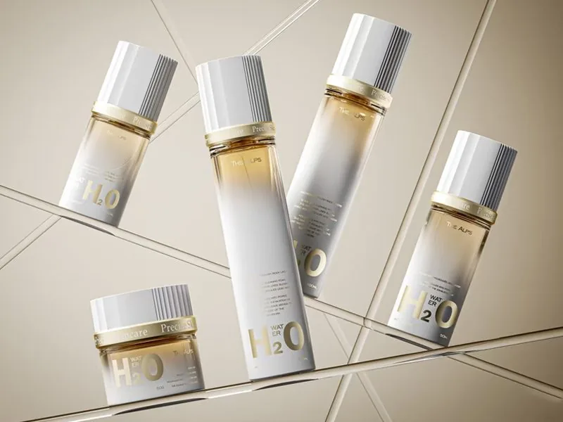
Matte black creates a sophisticated, premium appearance that works exceptionally well for anti-aging skincare, men's grooming, and luxury perfume collections.
Soft gray delivers understated elegance and appeals to mature consumers looking for minimalist design.
Earth Tones
Warm beige, sand, clay, oat, and mocha colors have become essential in sustainable packaging.
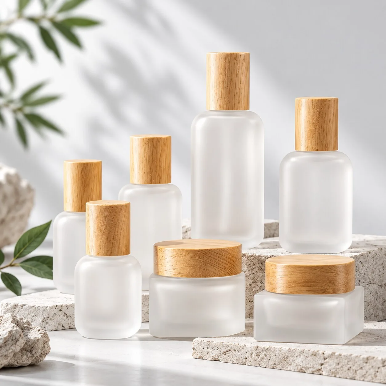
Combined with frosted glass, these shades instantly suggest natural ingredients, botanical formulas, and environmentally conscious branding.
Amber cosmetic glass bottles also remain popular because they combine a timeless natural appearance with practical UV protection for light-sensitive formulations.
Pastel Colors
Muted pink, sage green, lavender, and soft blue continue to dominate emerging skincare and fragrance brands.
These colors create a calm, approachable feeling while remaining highly photogenic across social media.
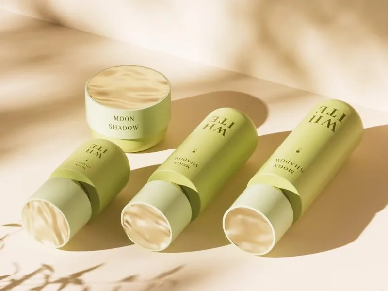
Many direct-to-consumer beauty brands combine pastel tones with gradient spray coating to create a modern look that's easy to recognize on Instagram, TikTok, and Pinterest.
Bold Colors
High-saturation colors make products stand out immediately.
They're ideal for seasonal launches, limited editions, makeup collections, and youthful beauty brands.
Rather than using bold colors across an entire product range, many established brands reserve them for special collections while maintaining a consistent core color palette.
Metallic Finishes
Metallic decoration isn't a color—it enhances one.
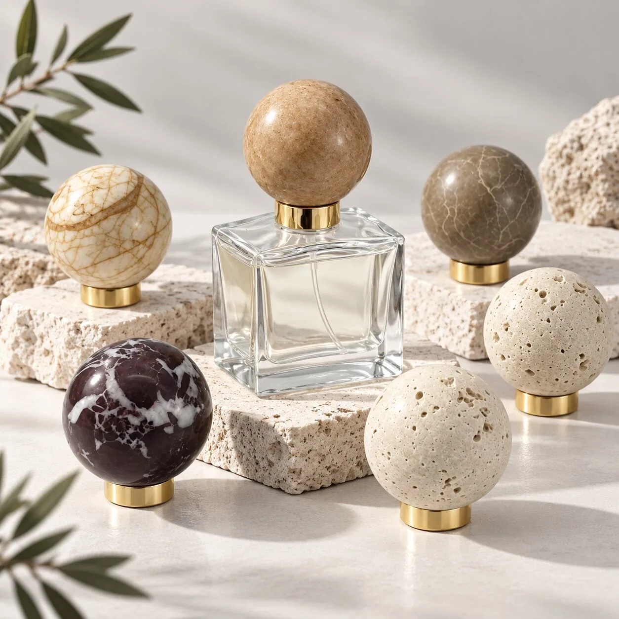
Gold accents communicate luxury and exclusivity.
Silver and chrome create a modern, clinical appearance that's often used in high-performance skincare.
Applied thoughtfully, metallic details elevate beauty packaging without overwhelming the overall design.
Glass Finish Matters Just as Much as Color
One detail many first-time buyers overlook is that the same Pantone color can look completely different depending on the surface finish.
A color sprayed onto clear glass won't look the same on frosted glass.
A matte finish softens the appearance, while gloss coating creates richer color depth and stronger reflections.
Gradient spraying adds movement and dimension, while electroplating transforms glass into a mirror-like metallic surface.
That's why we always recommend approving physical samples before mass production.
Digital color references are only the starting point.
Build a Consistent Packaging Color System
Strong beauty brands don't choose colors product by product.
They create a complete packaging system.
A practical approach is to establish:
One primary brand color
Two or three supporting colors
Consistent decoration techniques
Unified logo placement
Standardized cap finishes
This allows different product categories—such as serums, creams, lotions, and perfumes—to remain visually connected while still being easy for consumers to distinguish.
Consistency builds trust.
Match Packaging Color to Product Performance
Color isn't only about branding.
It also supports product protection.
For formulations containing Vitamin C, retinol, essential oils, or other light-sensitive ingredients, darker glass cosmetic packaging helps reduce light exposure and maintain product stability.
Moisturizers, body lotions, and hydrating products often benefit from lighter packaging that communicates freshness and hydration.
Good packaging combines aesthetics with functionality.
2026 Beauty Packaging Color Trends
Minimalism continues to influence global cosmetic packaging design, but brands are adding more texture and depth than in previous years.
Several color directions continue gaining momentum.
Quiet Luxury
Low-saturation earth tones paired with frosted glass and subtle gold details create refined packaging that feels premium without being flashy.
Perfect for luxury skincare and refillable collections.
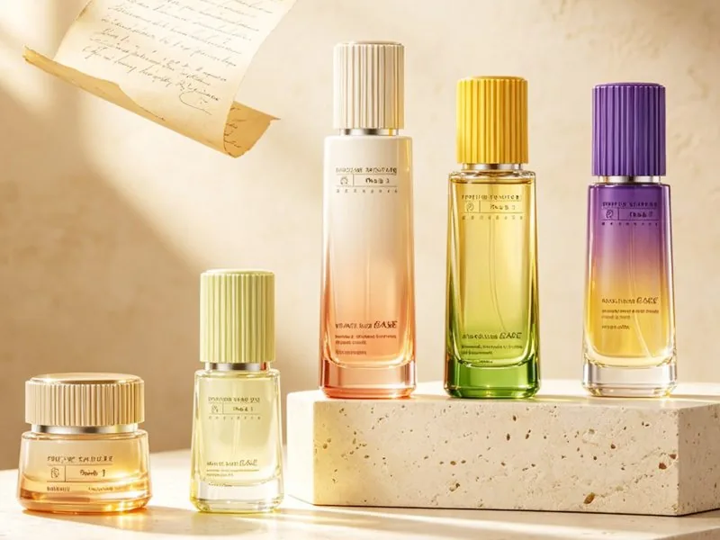
Soft Gradient Colors
Gentle transitions between pastel shades remain popular for serums and perfumes.
They photograph beautifully and perform well across social media marketing.
Minimal Black & White
Classic monochrome packaging with delicate metallic accents remains one of the safest long-term investments.
It ages well and adapts easily as product lines expand.
Deep Jewel Tones
Emerald green, deep amber, navy blue, and burgundy continue making a comeback in premium fragrance and anti-aging skincare collections.
These rich colors help products stand apart from lighter, minimalist competitors.
How Professional Color Matching Improves Consistency
One challenge many beauty brands face is maintaining consistent packaging color between production batches.
This is where professional Pantone color matching becomes essential.
At NAISI Packaging, we match colors according to official Pantone standards while considering the glass material, decoration process, and lighting conditions.
Before production begins, we provide physical samples so brands can verify color accuracy across frosted finishes, matte spraying, gradient coating, pearlescent effects, and electroplating.
This minimizes color variation and ensures consistent brand presentation from the first production run to future repeat orders.
Custom Cosmetic Packaging Solutions for Growing Beauty Brands
Every beauty brand has different packaging priorities.
Some startups need low MOQ custom cosmetic packaging to test the market before scaling.
Established brands often focus on exclusive bottle designs, premium decoration, and global compliance.
As an experienced cosmetic packaging manufacturer, we provide flexible OEM cosmetic packaging solutions for skincare brands, perfume companies, wholesalers, private-label manufacturers, and packaging distributors.
Our customization services include:
Pantone color matching
Custom spray coating
Frosted glass
Gradient finishes
Screen printing
Hot stamping
Electroplating
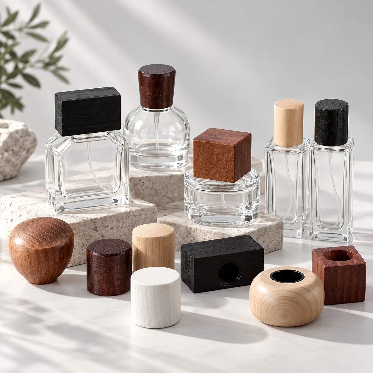
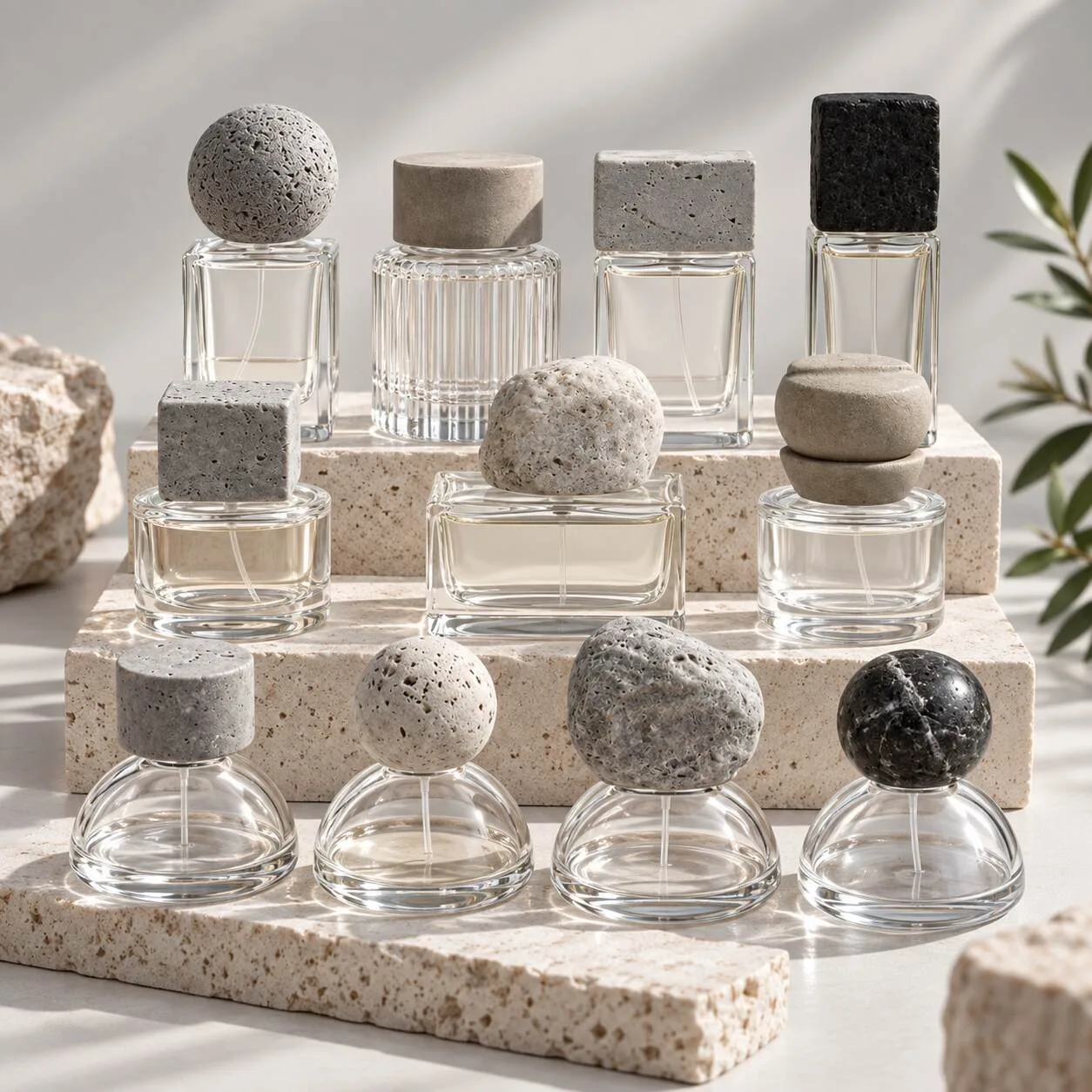
Custom caps and accessories
All decorative processes are designed with sustainability in mind and support current EU PPWR packaging requirements for international export.
Final Thoughts
Color is far more than decoration.
It's one of the strongest visual assets your brand owns.
The right packaging color builds recognition, increases perceived value, strengthens shelf appeal, and creates a consistent customer experience across every product you launch.
Whether you're developing custom cosmetic packaging, selecting cosmetic glass bottles, designing refillable glass jars, or refreshing an existing skincare line, investing time in a thoughtful color strategy will continue paying dividends long after production is complete.
At NAISI Packaging, we help beauty brands transform ideas into premium glass cosmetic packaging through professional color consultation, Pantone color matching, low-MOQ customization, and complete OEM manufacturing support.
If you're planning your next packaging project, we'd be happy to help you find the colors that truly represent your brand.
FAQ
What is the best color for cosmetic packaging?
There isn't a single "best" color. The ideal packaging color depends on your brand positioning, target audience, and product category. Neutral tones work well for luxury skincare, while earthy shades suit natural beauty brands and pastel colors are popular for modern skincare collections.
How do I choose colors for custom cosmetic packaging?
Start with your brand identity rather than personal preference. Define your target market, select a primary brand color, then build supporting colors that work consistently across your skincare packaging or perfume packaging line. Always confirm the final color with physical samples before mass production.
Does packaging color affect product sales?
Yes. Packaging color influences first impressions, perceived product quality, shelf visibility, and online engagement. A consistent color system helps improve brand recognition and can increase consumers' willingness to purchase.
Why does the same Pantone color look different on different glass bottles?
Glass type and surface finishing affect color appearance. Clear glass, frosted glass, matte spray coating, gradient coating, and electroplating all reflect light differently. Professional Pantone color matching and sample approval help ensure consistent results.
Can cosmetic glass packaging be customized in any Pantone color?
Yes. Most cosmetic glass packaging manufacturers can customize bottles according to Pantone color standards using spray coating, frosting, gradient finishes, pearlescent coatings, or electroplating. Physical sampling is recommended before mass production.
Are custom-colored glass bottles compatible with EU PPWR regulations?
Yes. When eco-friendly coatings and compliant decoration processes are used, custom-colored glass bottles can meet current EU PPWR requirements. It's important to work with an experienced cosmetic packaging manufacturer that provides compliance documentation and material testing.
Request Free Packaging Color Samples
🎨 One-on-one Pantone Color Matching Consultation
🏭 Watch Our Fabrik Production Videos
📞 +86 189 2275 3052